Harbour.Space
University portal
Innovative university degrees taught by industry leaders from around the world, aimed at giving students meaningful top-level professional futures
Year
2019
Field
Education
Role
Product designer
Location
Barcelona

Harbour.Space
University portal
Innovative university degrees taught by industry leaders from around the world, aimed at giving students meaningful top-level professional futures
Year
2019
Field
Education
Role
Product designer
Location
Barcelona

Harbour.Space
University portal
Innovative university degrees taught by industry leaders from around the world, aimed at giving students meaningful top-level professional futures
Year
2019
Field
Education
Role
Product designer
Location
Barcelona

Challenge
Harbour.Space University, known for its innovative degree programs taught by global industry leaders, aimed to create a visually unified digital presence that would communicate its distinctiveness and unique approach to education. However, inconsistencies in design approaches across its website and social media channels undermined this goal. Over time, brand interpretations varied significantly, leading to a fragmented visual identity and a lack of coherence across the university's digital ecosystem.
©2025
All rights reserved
LET'S
©2025
All rights reserved
©2025
All rights reserved

Design strategy
As Visual Designer and Art Director, my role involved aligning Harbour.Space’s digital brand to enhance consistency and strengthen its market positioning
After analyzing existing brand materials and assessing digital touchpoints, I proposed a shift from ad hoc visual updates to a structured, strategic approach focused on design unification. I advocated for a comprehensive visual identity overhaul, starting with the development of a systematic design framework that would ensure consistency across all digital platforms.

Color mechanics

Avatar mechanics

Color principles

Avatar principles
Design system
To address inconsistencies, I led the creation of a modular design system segmented into two distinct layers: "Principles" (core brand values and style attributes) and "Mechanics" (implementation guidelines and asset libraries). This structure provided clarity and flexibility, allowing designers and external collaborators to apply the brand's visual language accurately. The design system became a foundational asset that facilitated stakeholder buy-in by demonstrating the need for a cohesive digital transformation. To accelerate this process, I initiated partnerships with design studios, enabling a faster and more aligned rollout of updates across the website and digital channels.
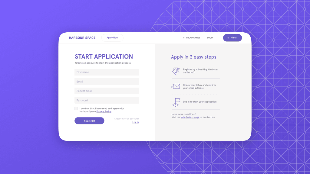
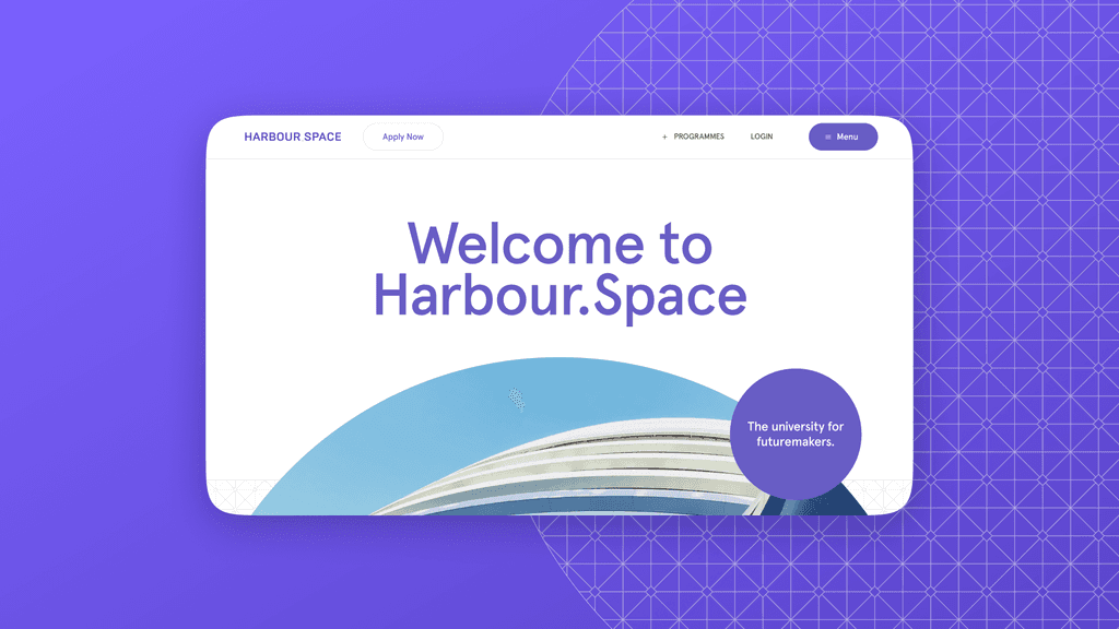
Pages based on design system
Application process
Marketing strategy
Recognizing that marketing materials on social media suffered from similar inconsistencies, I developed a framework to standardize visual assets based on their intended functions and audiences. This categorization allowed for a cohesive yet adaptable approach to visual styles across different social channels. By introducing a clear hierarchy for visuals, we strengthened the brand’s narrative while providing marketing teams with structured, purpose-driven assets that reflected Harbour.Space’s innovative character.
Brand consistency
Strengthened brand identity
The implementation of the design system across platforms reduced visual inconsistencies, reinforcing the brand's identity and ensuring a unified user experience
User engagement
Improved retention
The website redesign led to a 25% increase in user retention and a 30% decrease in bounce rates within three months post-launch, demonstrating enhanced user engagement
Social media impact
Increased engagement
Standardized marketing visuals resulted in a 20% boost in social media engagement and a 15% increase in follower growth, expanding the brand's online presence


